
*gasp*
Several of my students have told me about Canva and just how accessible and easy it is to use. I can be a bit skeptical at times but they have honestly spoken nothing but the truth here. While I may not have the creative writing bug yet, or lately in general, the ability to at least begin to envision, imagine, and/or visualize covers for my works is empowering (maybe too strong a word but I can’t think of a better one at the moment) to say the least. I may not have the artistic talent / experience to hand illustrate the things I see in my head or possible depictions but having some kind of agency to make at least a little bit of magic happen for myself is exciting. I can foresee many more in the future, but please take a look at the two designs I’ve managed thus far!
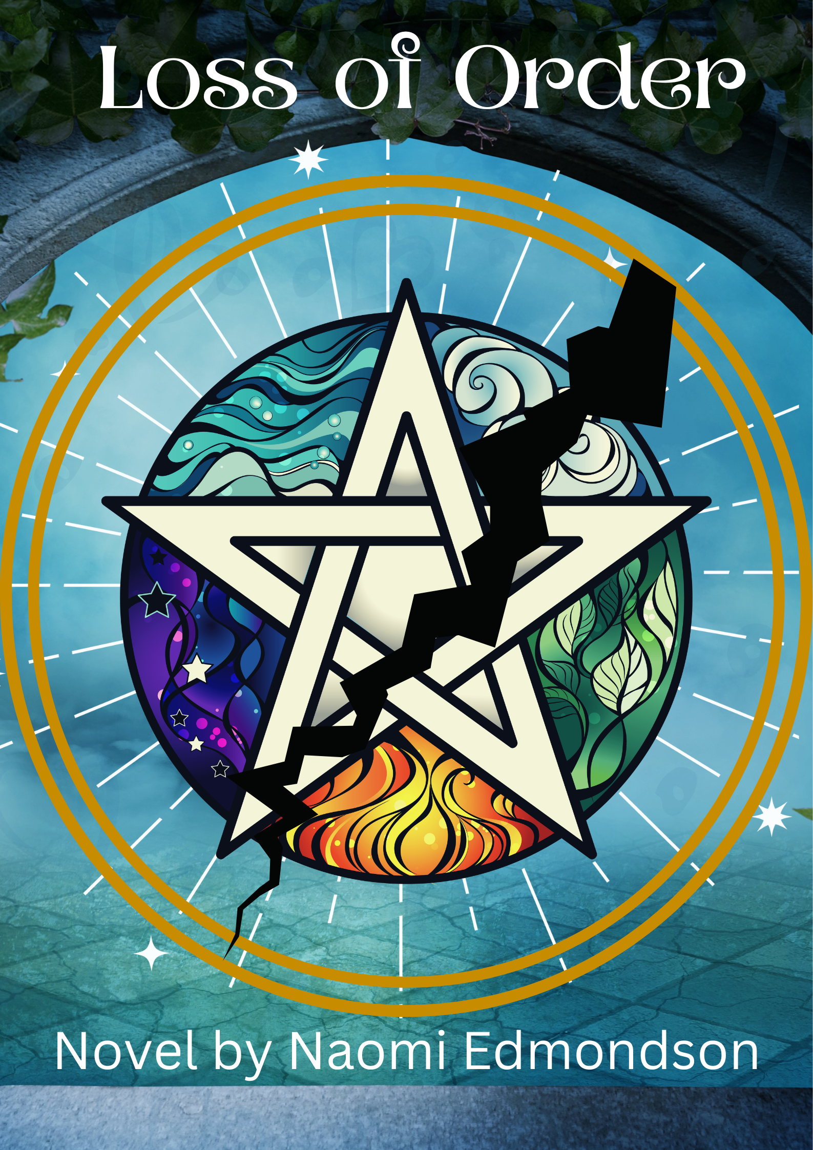

I understand I’ve got a lot to learn and a long ways to go but this is so cool! At least to me anyway. Comments, thoughts, and/or suggestions are more than welcome! Hopefully I can keep some of this momentum going for some of the other pieces I want to upload and write in the future. ^_^

Excellent, Naomi! I learned how you can add a darker or lighter near-transparent image behind text to make it pop regardless of the background image. There are so many tricks. My wife and I continue to trade techniques, which we use in our featured posts each Friday. And Canva keeps adding features that offer benefits rivaling the expensive products from Adobe. Thanks for sharing, and if you would like to see some recent examples, check out the Friday Feature on my site.
LikeLiked by 1 person
I’m definitely trying to figure out the tricks of the trade here. I know there’s a way to do what you’re talking about but I haven’t quite sorted it yet. Got one I’m working on that could really use that actually. haha But I’ll have to sign up to at least follow along. Looks like you’ve got a fair bit of interesting and useful info on your site for sure! Thanks for stopping by and commenting. I very much appreciate it!
LikeLiked by 1 person
As to the how, think in terms of “layers.” First, a background image. Then, position the near-transparent object (e.g., rectangle). Next, put the text layer over the near-transparent object.
Use the “Position” tab to move “Forward” and “Backward” the images, which lets you make sure the background image is the bottom, the near-transparent object is in the middle, and the near-transparent object is on top. 1 – 2 – 3. Easy-peasy!
LikeLiked by 1 person
Ah. That sort of layering. I am familiar with it, but I do think part of my problem is finding images I like that can also be made semi-transparent. haha I know there are images that serve that function already. Sometimes you just want a different one though. XD But I appreciate the explanation all the same! Thanks again!
LikeLike
Start with a rectangle and color it a shade that will blend but still give some contrast, like a white or light gray on a dark background or a charcoal on a light background. Then lower the transparency for that rectangle from 100% to whatever percent looks good. Just play with the transparency setting until it satisfies your preference.
LikeLiked by 1 person
I’ll have to play with it some more and see what happens but I do appreciate the explanation! ^_^
LikeLiked by 1 person